COLETTA & TYSON GARDEN CENTRE SITE DEVELOPMENT
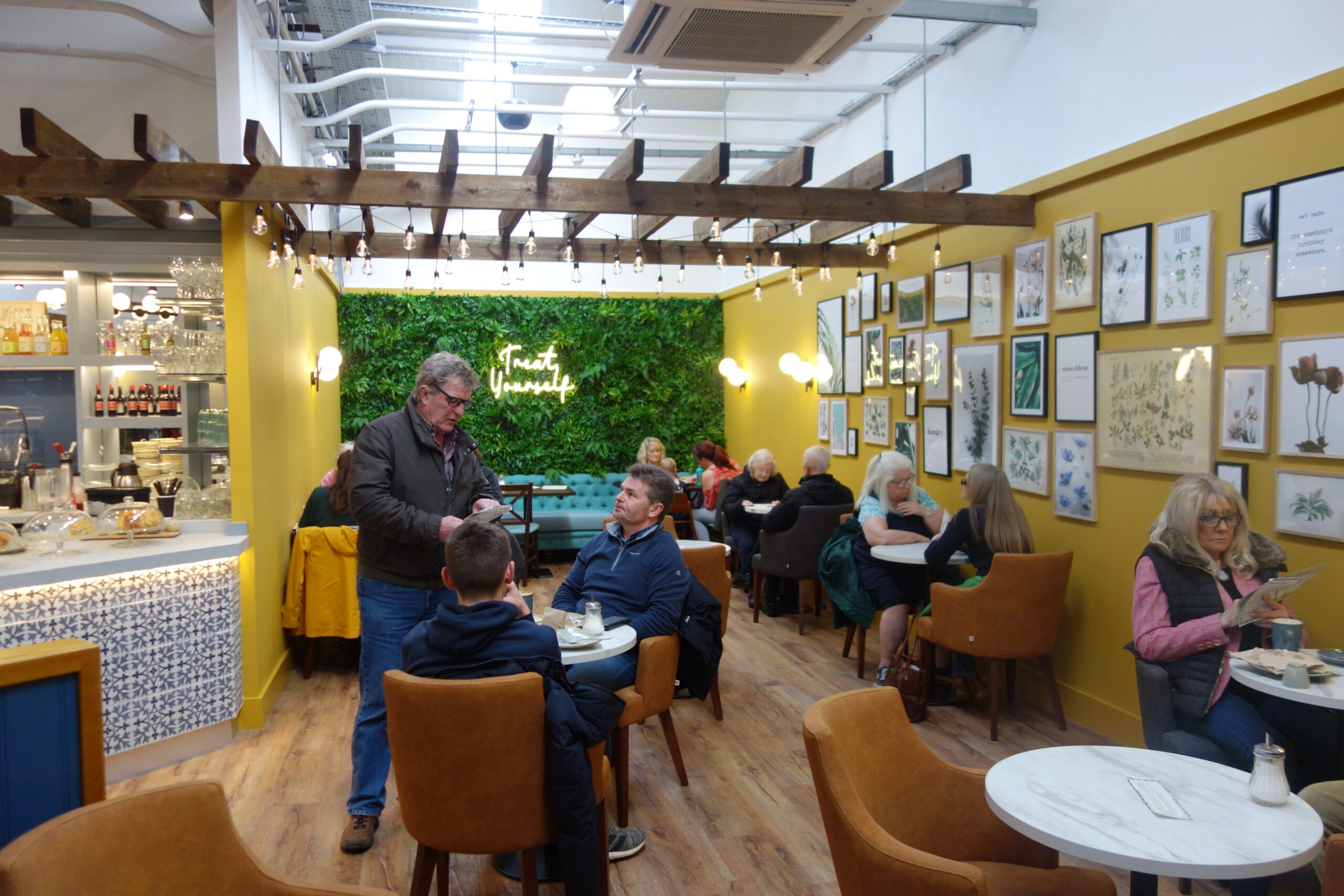
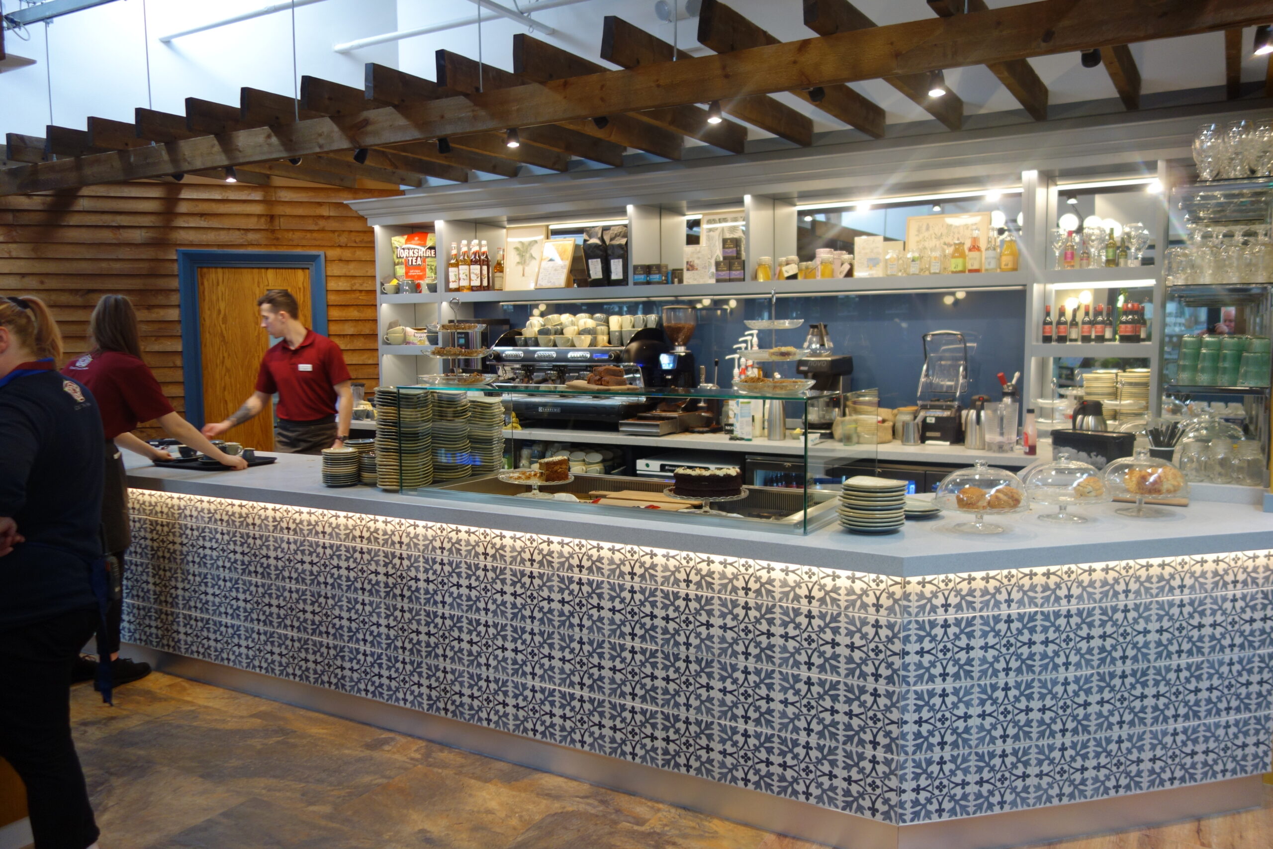
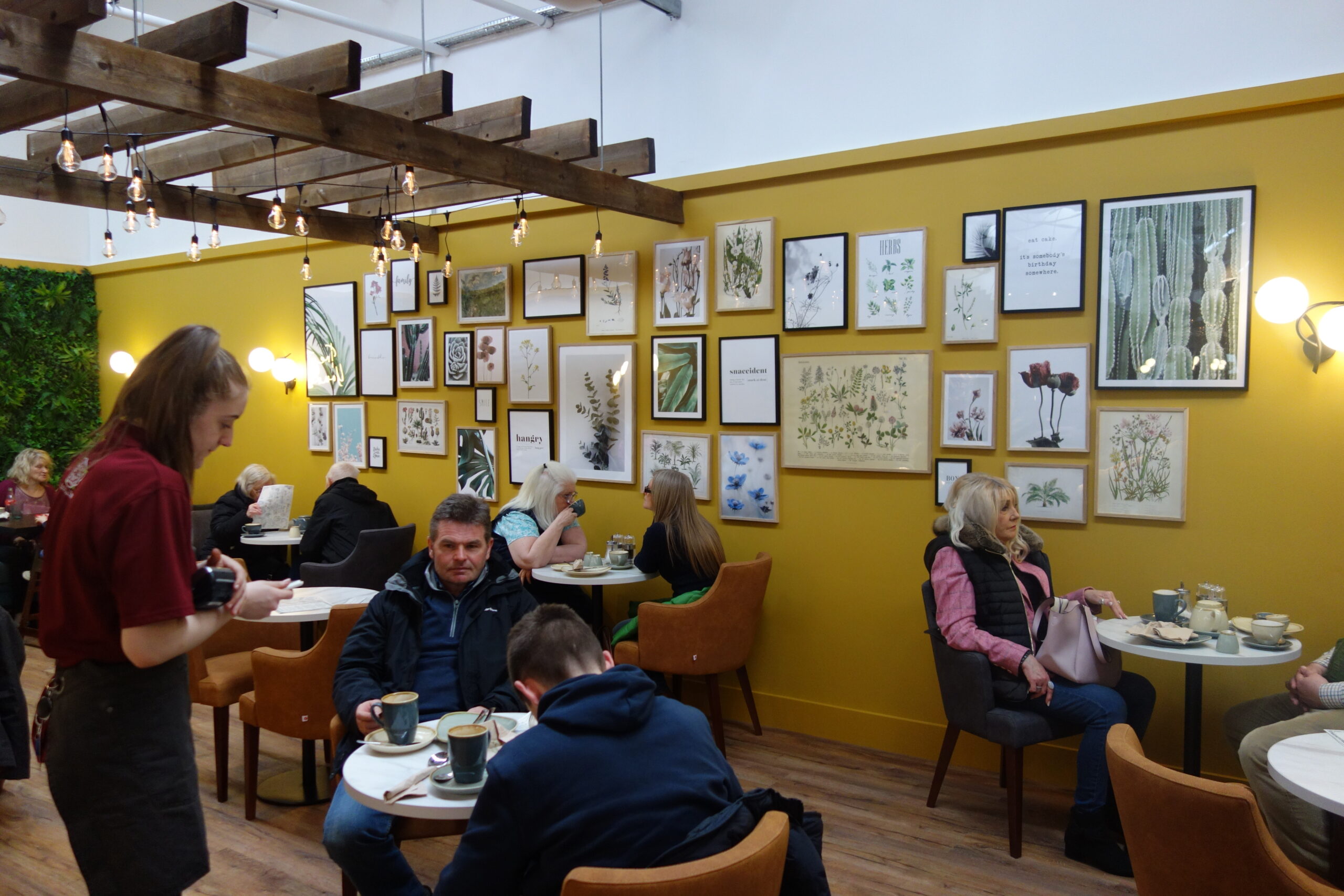
The restaurant has been divided up into three main seating areas. The first being off the main entrance with soft leather tub seating, walls finished in a continental yellow with botanical artwork, creating a relaxing atmosphere for casual customers to enjoy a quality coffee and speciality cakes, which are displayed beautifully in the new service counter. Part of the brief proposed by the client’s younger members of the team wanted to create within this area an ‘Instagram photographic opportunity’. With this in mind a vibrant coloured sofa with a faux living wall, LED signage saying ‘Treat Yourself’ was created by the team at Coletta & Tyson, giving the area a fun destination and focal point.
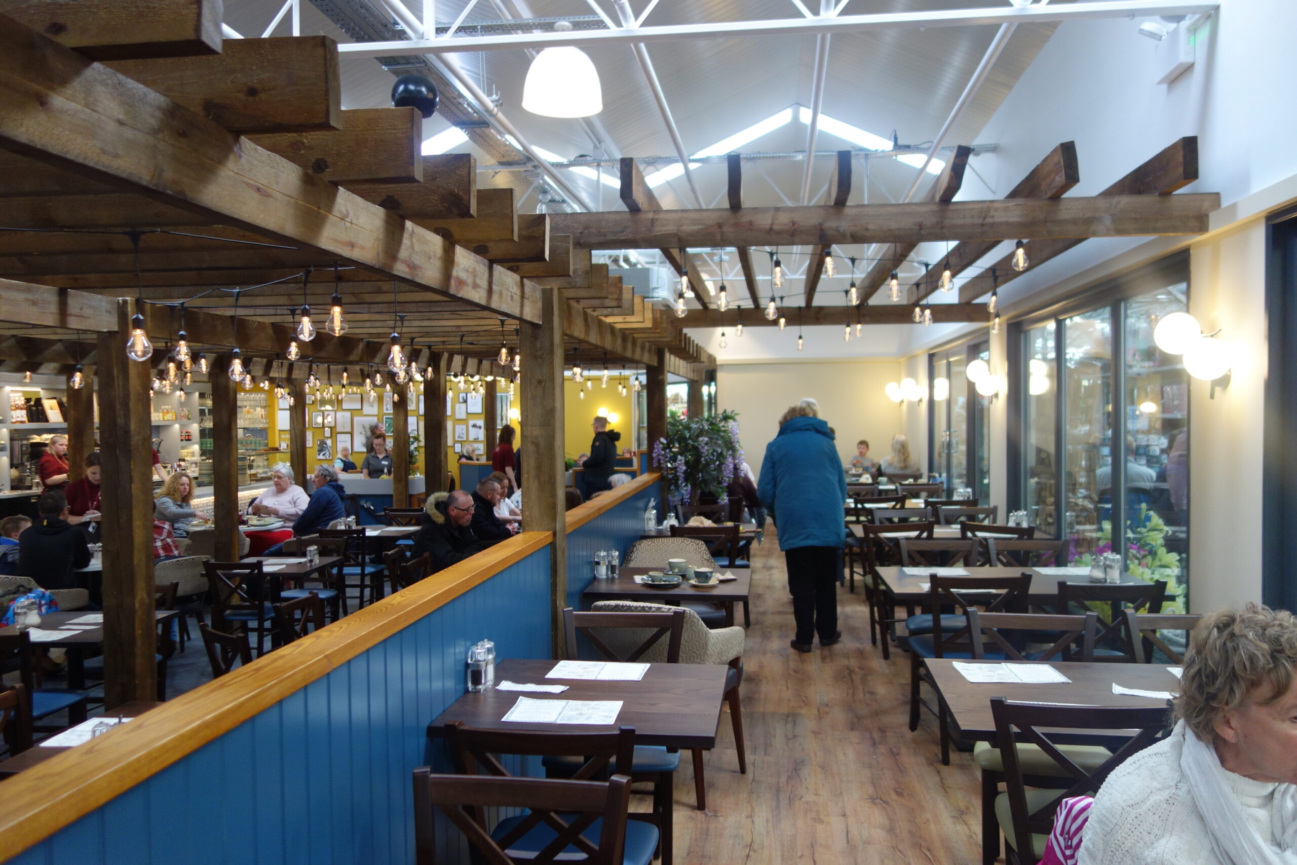
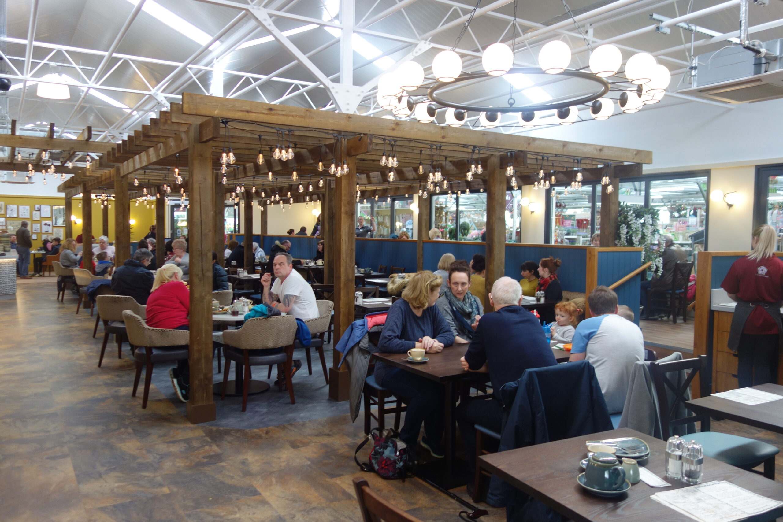
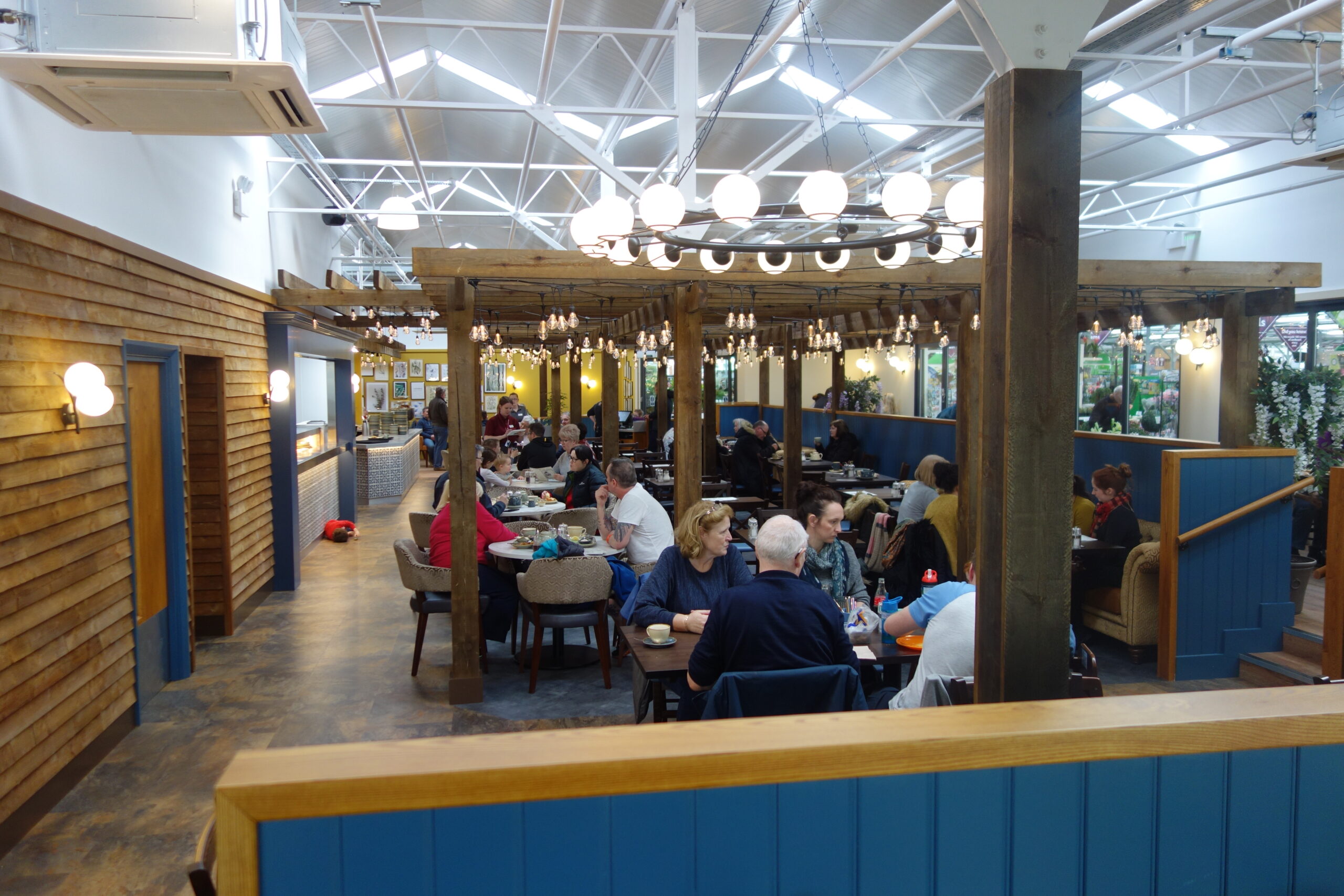
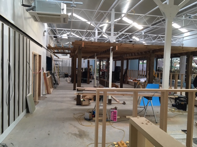
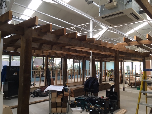
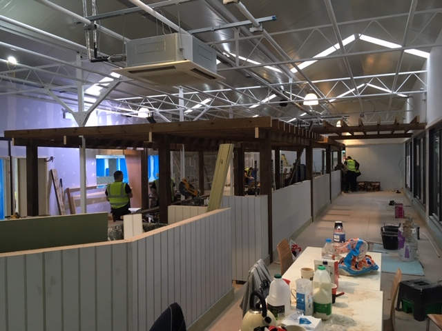
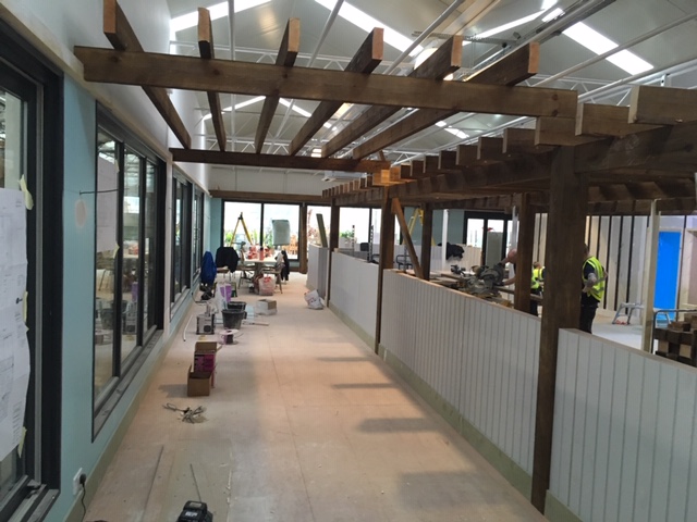
The central dining space with a large pergola structure has been enhanced with outdoor lighting being threaded through the structure, creating a romantic outdoor Italian garden feel. Along with quality timber seating, feature sofas have been introduced in a vibrant gold finishes to complimenting the continental theme.
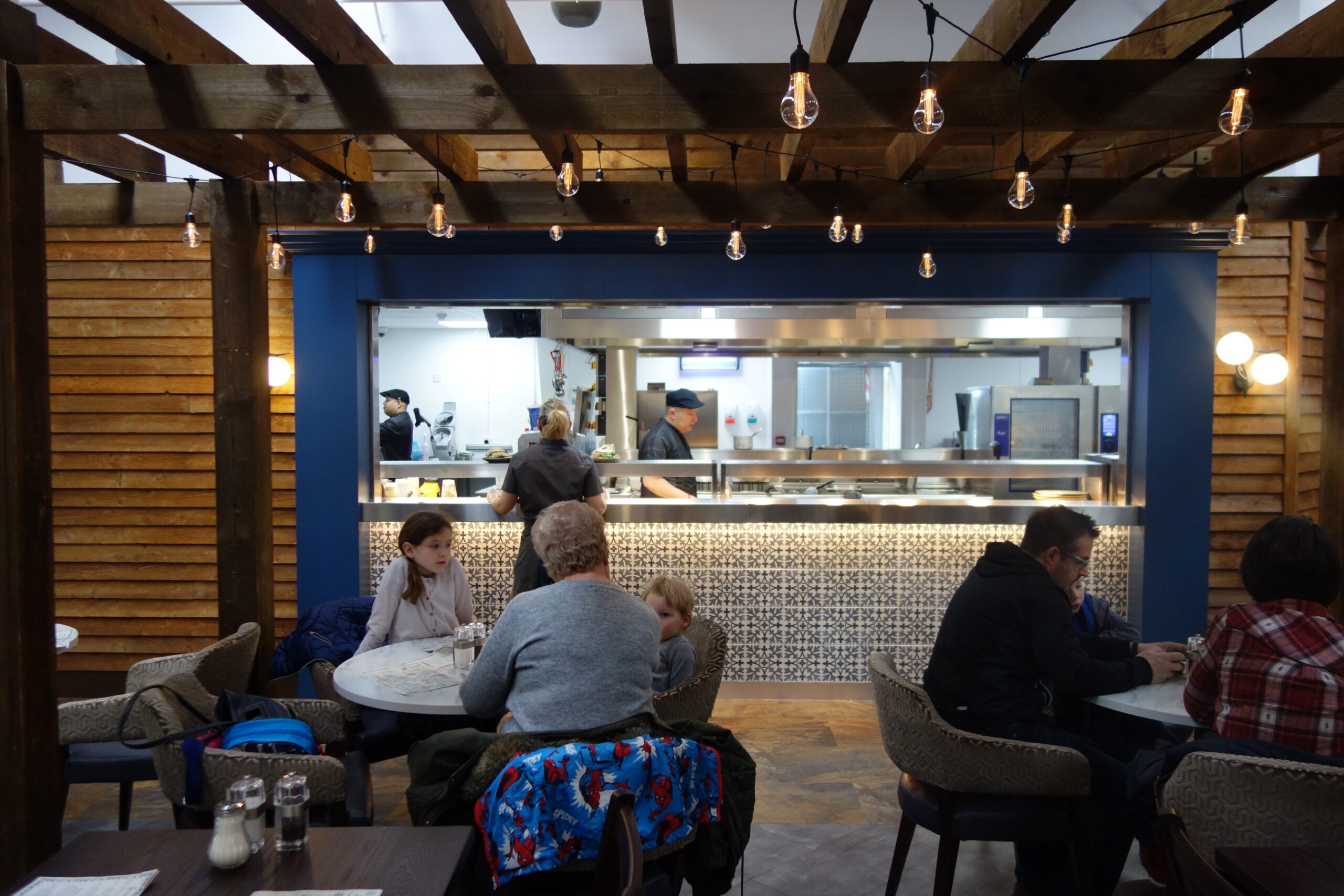
The final area to be created was a raised dining space to the rear of the restaurant that gives the customer panoramic views over the central pergola structure towards the kitchen servery area. Whitco Catering were adamant that they wanted to create an ‘open kitchen environment’ for Coletta & Tyson, exposing their new professional kitchen and dedicated staff to their customers and wanting to demonstrate the quality of food on offer. The introduction of a large ‘Hot Pass’ servery area enables the customer to view directly into the kitchen and share the preparation and cooking process, creating a sense of drama and anticipation.
The pass also provides a practical purpose as a food pick up station for the new waitress service staff to delivering freshly prepared meals quickly and efficiently to the customers tables.
INITIAL SITE
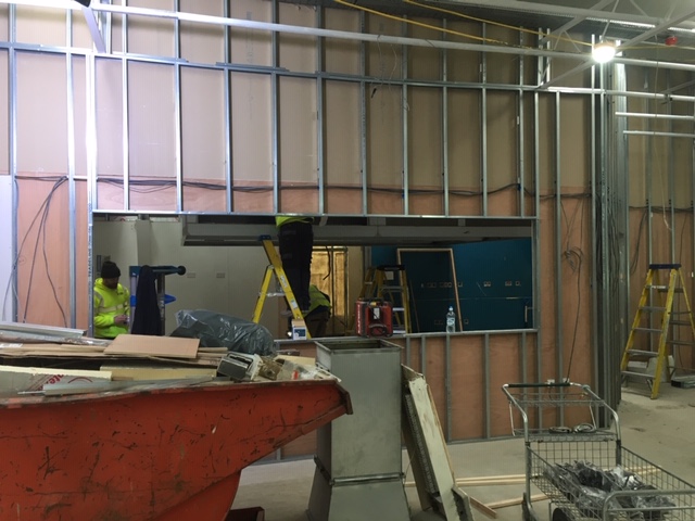
SITE REDEVELOPMENT
